Colours carry associations — some shared widely, some shaped by culture and personal memory. The notes below describe common associations, not rules: light, material and the colours around a shade change how it feels.
Colour by colour
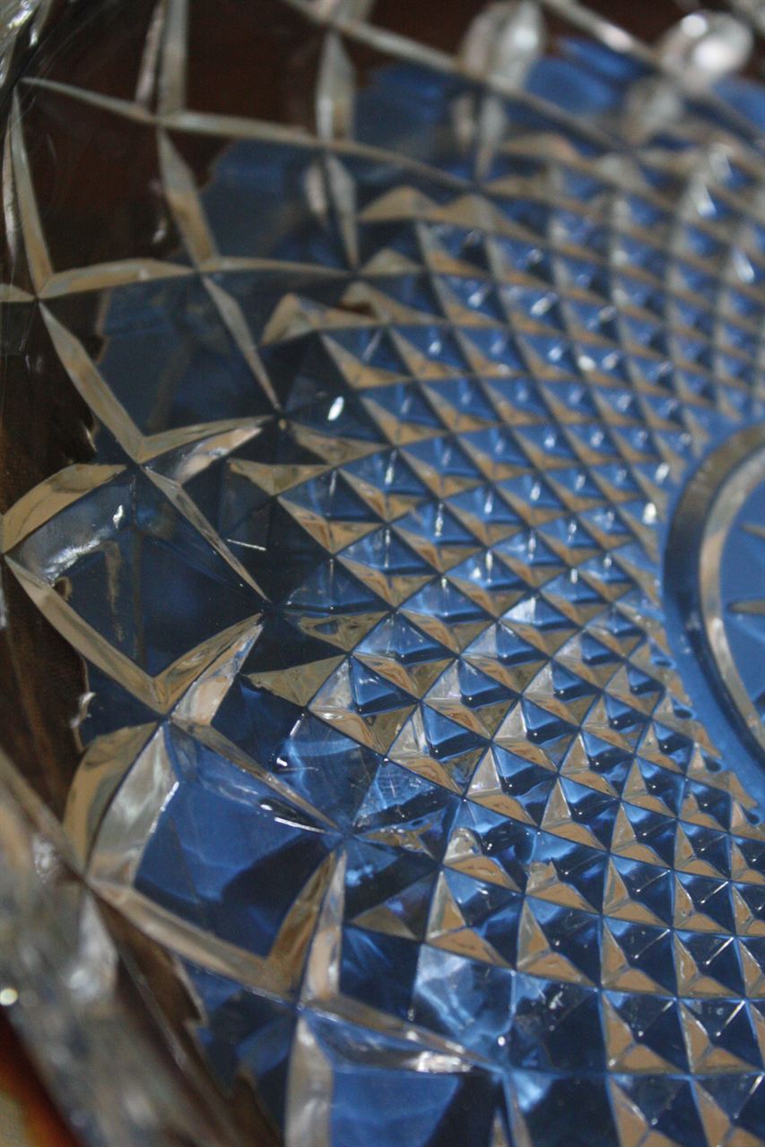
- Blue — often felt as calm, cool and spacious. Soft blues suit bedrooms and bathrooms; deep blues feel formal and enclosing.
- Green — linked with nature and balance. Works almost anywhere, especially with plants and wood.
- Yellow — cheerful and energetic in small doses; soft, warm yellows brighten dark rooms. Strong yellow on every wall can feel restless.
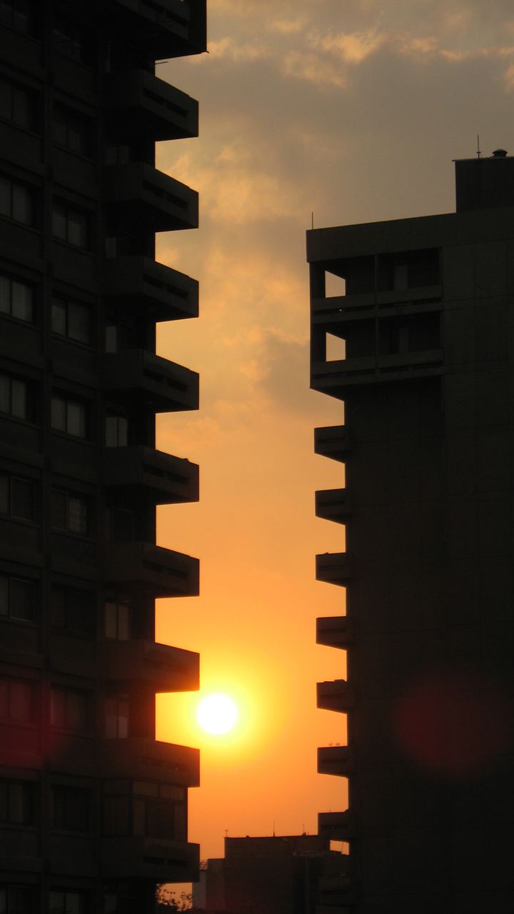
- Red and orange — warm, sociable and stimulating. Good as accents in dining and living areas; tiring on large surfaces.
- Neutrals — white, beige, grey and greige give calm backgrounds and let furniture and art lead.
Choosing by room
- Bedroom: soft, muted colours — blue-greys, sage, warm neutrals.
- Study: calm colours that don't distract; add energy with one accent.
- Kitchen: fresh, easy-to-clean colours; warm accents in dining corners.
- Living room: a balanced base with accents that reflect the people who use it.
The 60-30-10 rule
A simple guide for balance: about 60% of a room in a main colour (walls, large surfaces), 30% in a secondary colour (furniture, curtains) and 10% in an accent (cushions, art, objects).
Test before you commit
Paint large samples and look at them in morning and evening light. North-facing rooms make colours look cooler; warm artificial light makes them look warmer.
Tools for this
Share this guide
Published by
Zinat — a free reference to beauty and decoration, part of the ZIBADIS network founded by Masoud Moghaddam, designer and developer.